.png)
Tuesday, September 30, 2014
More States added to 1033 viz
I just added departmental level data for CA, WI, CT, SC, KY, PA, and IL. PA didn't have cost values with the data so the dots are all pretty small.
Sunday, September 28, 2014
Energy Usage, Smart Meters, Apps, and Devices
A while back our old electrical meters were replaced with fancy "smart meters." What this means is that our energy company, Detroit Edison (aka DTE), can more frequently read our meters remotely.
Hourly usage data is available for download on the website and I am able to look at hour electric as well as sporadic gas estimates and readings. I have a viz coming that looks some dashboards with this data.
 |
| Before everything was at the hour level |
 |
| Now I can look at minute level and current kW. The highlighted spike is when I was mowing the grass with my electric mower. |
There are also some other views with monthly and weekly overviews. Cool, but not that interesting.
Also available is the ability to overlay the hourly outside temperature over your energy usage. While the sounds helpful it really isn't as my heat is from gas, and the app only looks at the primary meter. My AC is on a separate, interruptible meter, that has a lower rate. The outdoor conditions have little bearing on my primary electric usage. Fans and the furnace fan are the only things that would show up.


Friday, September 26, 2014
Pillow talk in the bush
The title may be suggestive, but the graph really does a great job.

This graph from the Economist describes a 1970's era Bushman conversation. The graph is clear and able to easily get the point across. Having a background in Anthropology and a day job in BI this really hits home. I also want to watch The Gods Must be Crazy now.
Tuesday, September 23, 2014
The Cure for Spaghetti Charts
Do you want a few lines, but end up with spaghetti?
Do your line graphs look like this?

Well here is the solution. I missed this session at #DATA14, but I can't wait for the full replay to be available Andy Kriebel over at VizWiz posted a great video and tutorial that uses some chart switching to deal with crazy messes.
Friday, September 19, 2014
Gear Up: The Militarization of our Police under the 1033 Program
A few days ago I saw this cool viz on the Tableau Viz of the Day. I really liked it but the data is aggregated at the county level. You can't find out if your local police department has a grenade launcher or MRAP. Even scarier/funnier is that more info is coming out about Higher Ed and even some K-12 police departments that are getting military hardware.
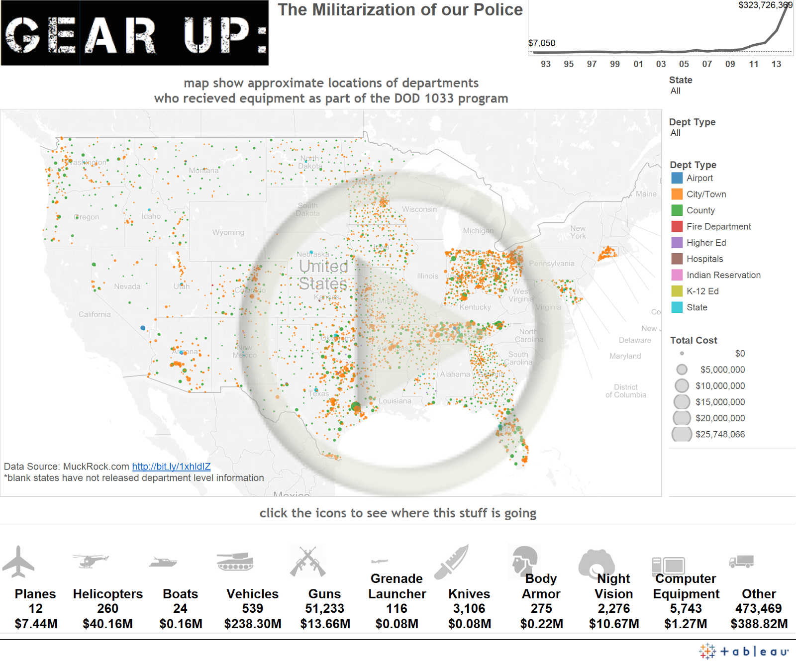
I did some digging and some detailed information is available. Muck Rock has submitted FOI requests to all 50 states, but as September 4 they have only received data from 26. Some have yet to respond and others have said they aren't going to release the specific data. I did some cleanup and grouping of the dataset they put together and came up with this viz. I also used the Bing Maps API with GPS Visualizer to geocode the locations of the various entities that received shipments under the 1033 program.
Wednesday, September 17, 2014
MacArthurFellows
So I was listening to the radio this morning and heard an announcement of the new MacArthur Fellows. I thought it needed a viz. I tried import.io to scrape the data and it worked really well.

Tuesday, September 16, 2014
Tableau Customer Conference 2014

I would like to start out by saying I had a great time. This was my fourth Tableau Conference and they have all been great experiences. The number of people has exploded. Attendance has quadrupled since I started going and I felt like a veteran with my "4 years" sticker on my badge. Occasionally I would run into someone with a larger number but I felt like I was surrounded by people just starting to use Tableau. This is all great. It is nice to see more people using such a great tool.
One thing that really baffles me is that I have been going to the conference longer than many of the Tableau employees. The growing pains this year were obvious. It is really tough to estimate how many people will want to go to a session; many of the sessions I wanted to attend had a line and maxed out well before the start time. There were similar issues at #TCC12, but not #TCC13.
Some of the new features announced for 8.3 and 9 look like they are going to be really useful. ETL is especially a pain point for many users. Performance is another area we run into and the persistent cache that is shared across processes will be really helpful at work.
I was able to attend a lot of great sessions and gather a bunch of great information. I can't wait until the videos are available for the sessions I couldn't make or were full. I was really torn between Andy Cotgreave's 100 years of Brinton talk and the Iron Viz Championship. I finally decided the the Brinton talk would be fine in recording, but Iron Viz had to be experienced. I hadn't made it a priority at any of the other conferences and was glad I was able to go. I think we need to do one here at work.
Monday, September 15, 2014
Disease Deaths and Donations
The below infographic came out comparing how much money was raised for disease research and how many people actually die from that disease.
 I didn't really like it because it was hard to draw correlations between the campaign and the deaths. Also the orders and colors were all crazy. Andy Kriebel over at VizWiz did a makeover, but I still wasn't happy with it. I decided to do my own and got some feedback on his blog post that helped refine the overall viz.

Sunday, September 14, 2014
First Post
This blog is supposed to be about my random data musings. Just coming down of the Tableau Customer Conference I decided I should have my own data blog. Let's see if that actually happens.

Subscribe to:
Posts (Atom)