Sunday, February 8, 2015

Snow Tires: Worth It

We are in the depth of winter here in Michigan. It was a bit warm, but we got over a foot of snow this week and temps are going to drop again soon. I have been working on a couple winter themed viz for this week between taking care of a new baby and the rest of life.

I have had snow tires for a long time now, but people have misconceptions about them: You really just need all season tires. My car has 4WD/AWD so I don't need them. I don't have money for winter tires.

I haven't had a chance to play with storypoints much in Tableau, but being able to adjust the caption size in the 9.0 beta is a huge win. I just want more formatting and layout options like a bullet list on the side.

Wednesday, October 8, 2014

Almost time to change your clocks, but now is the time to change your data.

Daylight savings time is coming up and it causes havoc with most of us. It also causes issues with our data. Timezones, daylight savings time, and UNIX timestamps all combine to cause crazy calculations.

Machine data often is based on GMT (Greenwich Mean Time). This is handy because computers all have their clocks set to the same time. It's like in the USSR where all trains ran on Moscow time. The benefit is that it's easy to compare times, but for humans we get confused when it doesnt line up with our watches.

The first step we run into sometimes is that UNIX timestamps. These are integer values that represent the number of milliseconds since the UNIX Epoch Jan. 1 1970.

Daylight Saving Time (DST) is some weird thing we do twice a year because of something to do with farmers, energy saving, and traffic accidents. Nobody is really sure.

There are a couple of methods of calculating all of these, but here is goes.

To convert a timestamp you can do this:


DATEADD('second', [Unix timestamp], #1970-01-01#)  


Now you have a GMT date. To convert it to Eastern Time (EST) and account for DST you need to -5 or -4 hours depending on if it is in the DST range. To determine the offset you can use this calc:

//determine if date [Date (GMT)] is in normal time
if 
 (datepart('day',[Date (GMT)])-datepart('weekday',[Date (GMT)])<7 
  and 
 datepart('month',[Date (GMT)])=3)
or 
 (datepart('day',[Date (GMT)])-datepart('weekday',[Date (GMT)])>=0 
  and 
 datepart('month',[Date (GMT)])=11)

or datepart('month',[Date (GMT)])<3

or datepart('month',[Date (GMT)])>11

then [Timezone offset]  //if it's normal time add the timezone diff from GMT (-5 for EST -8 for PST)
else [Timezone offset]+1  //if it isn't normal time its DST so add the offset +1 (-4 for EST and -7 for PST)
end

I usually roll them up into two calcs one for the above TZ offset and then the below calc that converts the timestamp and adds the offset.


DATEADD(
 'hour',
 [TZ and DST offset],
 DATEADD('second',INT([Unix Timestamp]),#1970-01-01#)
)


Tableau also have KB articles and Forum Posts that cover this as well.

To see how it all shakes out we have a sample viz.

Also note that some of these adjustments would have to be changed a bit to accommodate places like Australia and Newfoundland that have half hour time zone variance. 

Tuesday, September 30, 2014

More States added to 1033 viz

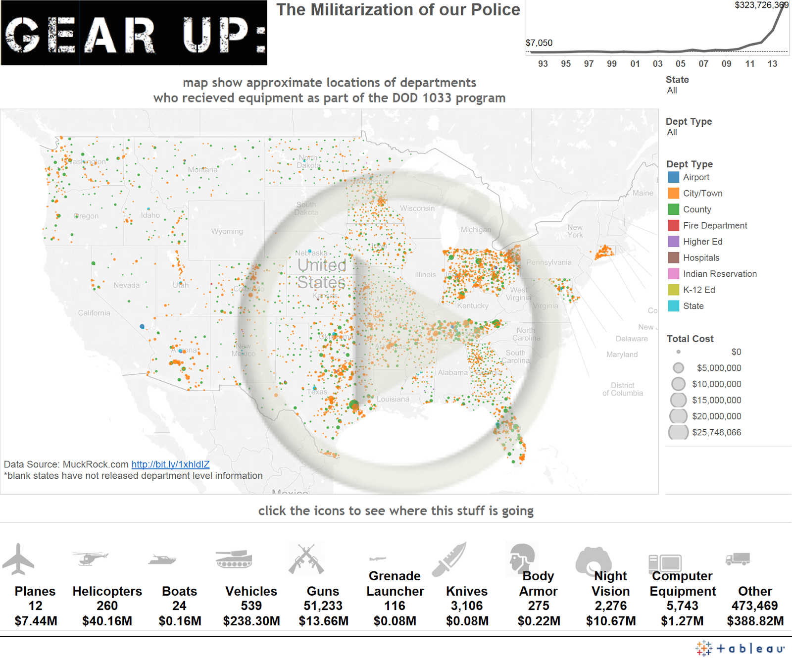
I just added departmental level data for CA, WI, CT, SC, KY, PA, and IL. PA didn't have cost values with the data so the dots are all pretty small.


Sunday, September 28, 2014

Energy Usage, Smart Meters, Apps, and Devices

A while back our old electrical meters were replaced with fancy "smart meters." What this means is that our energy company, Detroit Edison (aka DTE), can more frequently read our meters remotely.

Hourly usage data is available for download on the website and I am able to look at hour electric as well as sporadic gas estimates and readings. I have a viz coming that looks some dashboards with this data.

Before everything was at the hour level 
The other bit is they have a new smartphone app that can give me some basic graphs and report of my usage. A few days ago I also received and installed a energy bridge that connect to my network and it can then report minute level usage to DTE and myself using the internet instead of whatever protocol the meters normally use.

Now I can look at minute level and current kW.
The highlighted spike is when I was mowing
the grass with my electric mower.
With the lower level of detail I was able to pinpoint when the dishwasher turned on and heated the water, and when it dried the dishes. I am also able to see the furnace fan kick on for the first 15 minutes of every hour in circulate mode. This kind of information was lost when aggregated to a hourly level.

There are also some other views with monthly and weekly overviews. Cool, but not that interesting.

Also available is the ability to overlay the hourly outside temperature over your energy usage. While the sounds helpful it really isn't as my heat is from gas, and the app only looks at the primary meter. My AC is on a separate, interruptible meter, that has a lower rate. The outdoor conditions have little bearing on my primary electric usage. Fans and the furnace fan are the only things that would show up.


Friday, September 26, 2014

Pillow talk in the bush

The title may be suggestive, but the graph really does a great job. 


This graph from the Economist describes a 1970's era Bushman conversation. The graph is clear and able to easily get the point across. Having a background in Anthropology and a day job in BI this really hits home. I also want to watch The Gods Must be Crazy now. 

Tuesday, September 23, 2014

The Cure for Spaghetti Charts

Do you want a few lines, but end up with spaghetti?
Do your line graphs look like this?


Well here is the solution. I missed this session at #DATA14, but I can't wait for the full replay to be available Andy Kriebel over at VizWiz posted a great video and tutorial that uses some chart switching to deal with crazy messes. 


Friday, September 19, 2014

Gear Up: The Militarization of our Police under the 1033 Program

A few days ago I saw this cool viz on the Tableau Viz of the Day. I really liked it but the data is aggregated at the county level. You can't find out if your local police department has a grenade launcher or MRAP. Even scarier/funnier is that more info is coming out about Higher Ed and even some K-12 police departments that are getting military hardware.

I did some digging and some detailed information is available. Muck Rock has submitted FOI requests to all 50 states, but as September 4 they have only received data from 26. Some have yet to respond and others have said they aren't going to release the specific data. I did some cleanup and grouping of the dataset they put together and came up with this viz. I also used the Bing Maps API with GPS Visualizer to geocode the locations of the various entities that received shipments under the 1033 program.