Thursday, September 10, 2015

Attack of the Ashley Madison FemBots!

As a followup question about some of the hacked Ashley Madison data I was asked how the bots that we designed to drum up revenue compared to real people.  Here you go!

Annalee Newitz at Gizmodo had a good breakdown of insights from the second dump with the source code. 

Wednesday, September 2, 2015

Ashley Madison Data: Life is Short. Have a look at an Affair.

If you haven't heard the Affair/Dating site Ashley Madison was hacked last month and when they didn't pay up, the data was released. When I heard the data was released I was really excited. The amount and kind of data make this topic really seductive. 

This dashboard won't allow you to look up people you know (or your spouse). It is designed to show some aggregate information about AM accounts. 


On to the nerdy details! So the data was released as a bunch of mysql dump files so they have to be loaded into a database. The credit card transactions were daily CSV files that had to be merged (I used Pentaho). Getting this all in place was a bit of work, and then the huge amount of the data was bringing my computer to a grinding halt. I ended up creating some views to shape the data how I wanted it and then exporting the view to a text file to load in Tableau. Once in Tableau I could aggregate further in an extract. I ended up with a few smaller aggregated datasets and it is a pretty small workbook. 

The other issue was that there was no data dictionary so some I have a seeking field, but I have no idea what a 4, 6, or 2 means. Reports are that many of the females are actually bots that trick men into buying more credits. Annalee Newitz at Gizmodo had a good breakdown of insights from the second dump with the source code. Using this I have excluded bots from almost everything. 

Thursday, July 30, 2015

National Parks

During #TravelMonth I managed to get in two new National Parks (Lassen Volcanic and Olympic). My son was quizzing me on which parks I have been to and I had the idea to come up with a viz about the National Park System.

The first tab is a story walking though some general info. There is also a storypoint about the units I have been to and on the next one you can see how many you have. Leave a comment below with your results. Other tabs have a explorer where you can pick from a map and details about the different locations.

I had to pull the data from all over. There are a bunch of reports from the NPS Reporting site but they are by park and I had to ETL them together. The images I pulled down from the Unit web pages with import.io.

Wednesday, July 29, 2015

Find a NPR Station

I have been traveling and forgot to do anything for #TravelMonth, so I will put a couple out that I have been playing with. This is the first.

I may be bucking the trend of my generation, but I don't listen to music in the car. I always listen to NPR though. The first thing I do when traveling to a new place and getting in the rental car is to figure out the local NPR affiliate and change the station.

I love maps, so tracking down and figuring out how to model all the FCC Data for the stations was fun. They have 360 coordinates to plot the ring of station coverage, so Tableau is having to plot 361 points for each station. This is why I decided to display one (my home state) to load. It is about a quarter million points for all of the US. Originally I was going to do it for all radio stations, but it was north of 6 million rows/points and was horendiously slow. I have that dataset if anyone is looking for it, let me know. The coordinates were in 17,000-ish individual KML files that I was able to ETL using Pentaho Data Integration into one dataset.

Dual axis maps are only doable in Tableau if you have the same lat/long field. In my case the station lat/long was different from the coverage area lat/long so I had to put the station info in the center of the coverage area, not where they actually are. That caused some wonkiness with some stations on a coast or border.

I really wish that Tableau would build in location awareness. There are so many ways this could help. Imaging a salesperson loading up a viz and it automatically filters to the state they are in, or clients in a x mile radius. For this example I would love to be able to have it zoom to where you are and then show stations that you can get. Instead I have to lean on the new map search or people manually filtering by state.

Monday, June 22, 2015

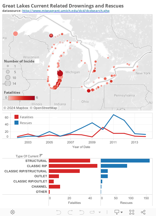
Great Lakes Deaths Due to Water Currents

I was sent this article today and the search tool they had built for this dataset was pretty rough to use, so I made a Tableau version.

Friday, May 8, 2015

More features for Tableau Public

Tableau Public just became more powerful. More details here. I have run into some limits before. Most recently with my snowfall viz. It has about 2 million rows of data, but Tableau Public only allowed 1 Million. Now 10 million rows are allowed so I just updated it with more historical data.


Wednesday, April 22, 2015

Trees of Ann Arbor

Today is Earth Day so I thought I would get out a dashboard of Trees from the City of Ann Arbor.

Some of the data was tough going until I figured out that the X/Y coordinates were an actual system. I had a background image of a map and was messing with scales until I discoverd the State Plane System. Then things went quickly and I got the data converted to Lat/Long and cleaned up and grouped.

Click the dashboard below to load